Source: Taiwan.cn
A website managed by the Taiwan Affairs Office of the State Council released on Wednesday its new logo, symbolizing unity as well as the same Chinese roots of compatriots across the Straits, a move that has been interpreted by some netizens as sending a signal to separatists on the island.
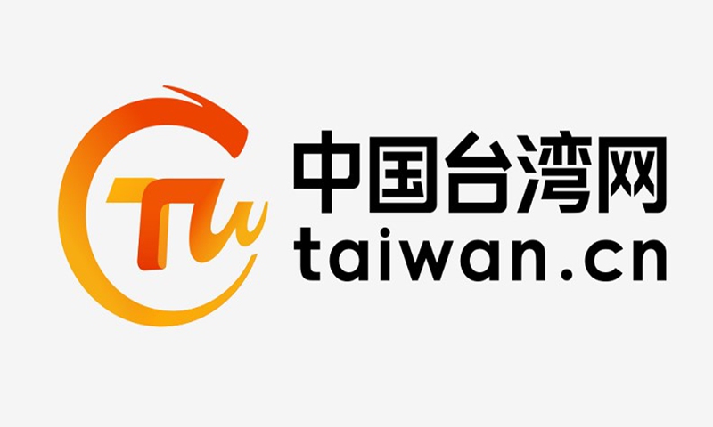
The website taiwan.cn announced its new logo design on Wednesday along with a brand new webpage, saying in a release that the new release carries the hope of better cross-Straits ties.
China Taiwan Network, usually referred to as Taiwan.cn, was established in July 1999 and is a national key news website managed by the Taiwan Affairs Office of the State Council.
It is an important window for people on both sides of the Strait to communicate and understand each other, and for people from overseas to understand the mainland's policies on the Taiwan issue.
The overall logo color of the letter CTW is warm yellow, suggesting that the people across the Straits are descendants of the Yellow Emperor, according to taiwan.cn.
The Yellow Emperor, or Xuanyuan, is the legendary ancestor of the Chinese people who helped lay the foundation for China's 5,000-year-old civilization.
The three letters are designed as mother and child dragons that intertwine and embrace each other. The young dragon grows up in the arms of the mother dragon, which means that people across the Straits are connected, cooperate closely, and integrated.
